Designing the beta website

In a previous blog post, we touched on the design of our new beta website. To explain in greater detail, we interviewed one of our user interface (UI) and user experience (UX) designers, Alex Pereira, on his work.
How did you come up with the designs for the new Scouts website and what principles or ideas, if any, guided you in your design work?
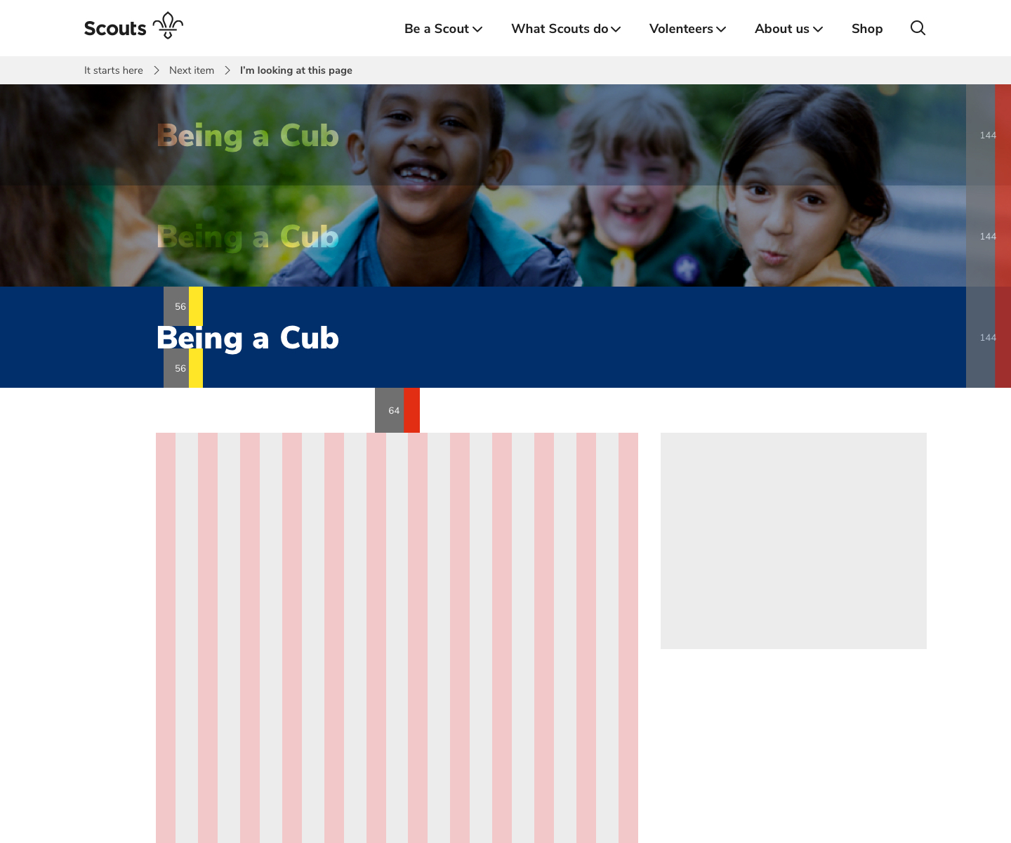
The new website is based on standard web design principles using a 12-column grid. This transposes easily into a mobile device template, which is really important these days. The design itself is inspired by our brand identity and applied to all the new visual work currently being produced by the team. Because we are working with interactive digital elements more consideration is needed from a user’s perspective.
Ultimately, the user is the primary focus. We need to give them the clearest and most intuitive path whilst trying to maintain as many of the principles of the brands' tone of voice – Confident, Active, Challenging, Inclusive, Optimistic.
Was there anything from the existing Scouts websites that helped to inform your work?
One of the best things about designing the beta website is that it was a completely blank page to start with. There are no influences or distractions from the old website’s design. Building a complete UI design system from the bottom-up is an exciting and challenging process.
The improved design will also be mirrored on how the majority of pages are going to function. Users will have enhanced and new features when the work is fully integrated.
What tools did you use?
The primary tool I use is Sketch, because it allows for a fast, iterative design process. The goal is to eventually create a complete library of usable building blocks. When a comprehensive library is in place the pages literally build themselves!
Why is good design so important when building a website?
Every page has a purpose and if it is badly designed users can get confused. If they’re confused, that could eventually see them leave that page.
The user’s journey through a website can be more guided when consideration is given to typography, space and colour. Building a successful experience that reinforces the brand values is vital so that users feel happy to return and endorse what has been made.